Tuesday, October 19, 2010

basic element - week 7


This artwork represents a successfully poster that persuade its viewers. The majority parts of this image are constructed by the tone element. The gray tones that are presented throughout the entire poster to emphasis the feeling of sadness and helpless in the life of this child. The feeling of sadness are enforced through the contrasting of firearm and the seriousness of the child and his age. The artist presents the seriousness through applying heavier dark tones on the face to represent the heaviness hardship that this child encounters. This poster emphasized the hardship using gray tone as negative background while using light dark red on the positive to empowers the concept of infant sadness. The artist uses different colors to separate the word, infantry, to reveal the sadness behind the child infantry. The white color tone is used to separate the word, infant, from the rest of the word to represent that infant are born to be innocent. The black color tone is used to separate the word, ry, from the rest of the word to represent that darkness within human races force these innocent infants to become dangerous infantries. The red background represents blood that spread while these child soldiers eliminate life of others. These techniques successfully construct an overall sadness while powerful concept to viewers of infants who are used as weapons to eliminate others.  The most important for designing a poster is to make the viewers understand the concept of it through the first glance.


There are enormous color elements usages within this image. The artist uses fresh and bright color to contrast with each other, which enforces each  shapes to stand out from each other. These techniques enable the image to pop out from the poster. However, the author also uses contrast color to  emphasis the shape of the main character in this image.  Blue and yellow are contrasting color so people would focus on the Snow White more than other seven dwarfs due to the hight contrast between these two colors. The saturation of the positive characters is stronger than negative background so viewer would focus on the positive characters. Colorful images present an feeling of warmness and happiness, which will attract many viewers such as child. Most of colors on the children’s book are fresh and light to emphasis the feeling of happiness and warmness to comfort and care to their readers, especially child.
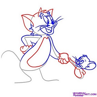


The artist use gray lines heavily to construct the basic body shapes of each individual characters. The gray lines are used to make body shape enclosures while position them correctly into their proper locations. The blue, red line is the iterative process, giving more detail to the exist body shapes of each individual characters. They also represents light directions, which helps the artist to place shadows and colors more correctly. The important part of design and sketch process is to position each element correctly, such as characters, backgrounds, lightings, and actions. These design successfully accomplish these important goals, which helps the artist to have strong foundation for a successful work. 

good and bad design -week 6


This poster demonstrate a design that successfully present its goal to its target audiences. Print advertisement designer focuses on present an idea to audiences with symbols that empower original ideas into powerful statement. The artist of this picture presents a balanced but sharpen structure through contrast. Even though that most of poster presents negative area, such as the blue background, but the color of the positive symbol, the white pigeon, successfully sharpen the ideas of this poster. The white pigeon that flies upward and the enlarged word “Peace” balances the poster and makes it to have a sense of level. It uses other color such as green in symbol, the green leaf, with the word to tight the balance. Three colors that are chose for these image also presents similar idea, the peace and softness. These techniques build an idea of Peace into a powerful and sharp idea that have great impacts on its listeners.


This poster presents an unsuccessful attempts to present the point to its audience. Major design mistakes that print advertisement designers make is fail to help audiences to understand and accept the point. One of mistakes that this image presents is fail to sharp out the main idea. There are too many overlapping areas that make the main idea, which is the football player, difficult to see.  It is a stress on the middle of this poster.  It looks so busy and too much detail on it. The contrast of colors between the negative background, which is the mixture of gray, violet and orange, and the positive symbol, which is the white football player, is difficult to distinguish. The orange color of the negative background is sharpen than the white color of the positive symbol. The first moment that audiences view this poster, the orange background will be the first sight instead of the football player. These techniques fail to attract audiences to understand and accept the target point of this poster, since ideas are neither clear nor strong enough to be understand and accepted.

Tuesday, September 28, 2010

visual information : sick economy - week 5

This economic poster presents an critical problem within current economic situation. Falling of stock is an important visual representation for the current bubble economy. The falling of stock is illustrated through a red arrow that points downward with a background of a one hundred dollar bill. One pencil is drawing  Benjamin Franklin’s mouth to symbolize the uncertainties within current economic.  This picture symbolizes that the United States of America is currently facing a enormous economic problems. The pencil that place above the mouth of Benjamin Franklin symbolizes the duty and the power of the world to change and to save the economic problem. It is now depends on the government and people to find a solution to draw out a future that will shape the one hundred bill, the economic, or destroy it. Red stock arrow represents an critical problem within stocks of the world, and the bigger arrow head represents an enlarger problem as stock keep falling down. The image symbols that employs by this kind of economic related image often are arrows and dollar bills since they reflects economic objects such as stock and currency. Color such as red and green reflects status of current economic such as red represent dangerous while green reflects safe. The combination of economic symbols often build the image to a deeper meaning on how these objects interact with each other. The stock arrow and dollar bill background reflect how falling stock greatly impact current currency system. These image adopt such techniques to represent critical issues within economic that the world is facing today.

Another representations for this kind of image is economic/political comic. These types of economics often place current important issues in an extraordinary ways that enforce viewers to accept such problems. Economic comics often employs large pile of money and large stock arrows that falling down or flying away to represent desperate economic situations. However, most comics employ heavy line usages and objects often have less detail than real life picture. Most of them are in white and black instead of the colorful tendencies that economic image above employs.


Monday, September 20, 2010

Puzzle - Various Visual Thinking - week 4

Areas in the Big Square by Peter Grabarchuk
The shape consists of overlapped color circles. Which two colors have their total visible areas equal?
It is a "Gestalt Principle: Symmetry" image. So I saw it as whole of a figure. 
In my way, I draw the black line to restore the circular original. (restore the individual part). I follow the “finding” that shape out each circular figure and make the circular figure more basic.
So I can easy to see the area which is hiding by other circular figure.
For red area- it has six areas that are explicit while other three areas are hide by yellow area and two blue areas.   (+6 and -3)
For green area – there are seven explicit areas and three areas are hide by two red and one blue. (+7 and -3)
For blue area –there are seven explicit areas and three areas are hide by two yellow and one green. (+7 and -3)
For yellow area – there are eight explicit areas and two areas are hide by one blue and one red. (+8 and -2)
So I count the blue area and green area has same visible areas.

My friend’s (Kent) solution: The picture shows the fragments of circular figures to viewer. But in our brain, we still can see the whole circular figures. It is the visual memory in our brain.
So he thought each circular are perfect circulars. And he counts the parts that are hided within another circular figures.

For green area – the fourth row far left, it is only one part that was hiding by another green.  The fourth row middle and right one; it is also same as for the fourth row left one. Finally, the last one hides in the third row far left. There are three part hiding on the green and red.  So it is 1 1 1 3 = 6.
And so on,
For red area – 2 2 2 1, there are seven areas covered
For blue area – 0 2 3 1, there are six areas covered
For yellow area- 0 1 2 2, there are five areas covered.
Accounting to the data, we can know the green area and blue area have same visible areas.

---------------------------------------------------------------------------------- 
Three Bracelets by Peter Grabarchuk
In my solution, I compare the right bracelet with the bottom bracelet. The one triangle of the right bracelet is point toward a different direction than the one in the bottom bracelet. I compare the two bracelet by using the method of “matching,” but it is not the same one. I keep comparing the left bracelet and bottom bracelet. I discover the two bracelets are the same. The only different is the left bracelet is flipped. It is “visual induction II”.
So I find the left bracelet is same with the bottom bracelet.

Kent’s  solution.
He looked for the common parts within the three bracelets. First he keeps remembering the set of two triangle that point toward each other and the set of the two triangle that point toward the same direction. “Matching” another two bracelets. It can find the right bracelet is different with another two bracelets. The left bracelet and the bottom bracelet are the same one.


Tuesday, September 14, 2010

Feature Channels and Visual Search Week 3

This poster presents features of both feature hiearchy and visual searches. This poster presents similar color themes throughout the entire images. The bottom color is similar to the objects except the red object. The artist uses color feature channels on the form of the arrowhead. So the red people figure can stand out from rest of other figures. Also, the arrow brings motion and direction to viewer. When viewers look this image, they will follow the arrow direction unconsciously. we can feel the red object are more closely. This features allow the entire image to represent as a more reliastic three dimensional arror that faces toward viewers.
Viewer are attracted by color feature channels easier.
Color feature channel can use on the children education webside. it make children more understand the main opints. Feature channel enables children to have more understanding about educational subjections. Visual searches enforces children to carefully examine pictures, which make them to have a  more solid understanding of target subjects.

http://www.google.com/imgres?imgurl=http://pic1a.nipic.com/2008-10-22/20081022213028948_2.jpg&imgrefurl=http://www.nipic.com/show/1/53/068a0af4bc1991f4.html&usg=__-ehd02cqJL2XotEoYHnNKYuKEak=&h=768&w=1024&sz=81&hl=zh-TW&start=57&zoom=1&tbnid=536SXaHUvFRpoM:&tbnh=145&tbnw=193&prev=/images%3Fq%3D%25E7%25AE%25AD%25E9%25A0%25AD%26um%3D1%26hl%3Dzh-TW%26sa%3DN%26biw%3D1440%26bih%3D755%26tbs%3Disch:10,1264&um=1&itbs=1&iact=rc&dur=550&ei=PR-PTN_3O4jQsAPX3riyDg&oei=Mh-PTOLNNMKcnweXyMDgDA&esq=3&page=3&ndsp=28&ved=1t:429,r:17,s:57&tx=99&ty=68&biw=1440&bih=755

Tuesday, September 7, 2010

Top- Down Visual Processing - Week2


It is a very interesting picture. I only saw the light and the curtain at the first glance of the picture. I can’t separate the background and object. Because of the colors are similar to each other and visual process is light and curtain first. Visual process would disregard other colors and objects. On the second moment, brain and eyes keep to thinking and seeing about this picture. My brain discriminate the real object from the background and also discover the daub of the background.

This is an example of the top down visual processing. We usually use the visual process on the website research or poster. For example, on the YAHOO homepage, the most important news would be apparent and easy to understand. YAHOO achieves this result by techniques such as adopt large and colorful pictures and/or texts to attract visitors. YAHOO homepage use the visual process to attract people read the news.