Tuesday, October 26, 2010

Depth perception -Week 9


http://www.food2.com/images/blogposts/Hulk.jpg 
This is a successful demonstration of depth/size cue poster. The artist emphasizes the enormous size of the main character, Hulk, through comparing him with the objects that we are familiar such as building and vehicles. The overlapping of the main character over the white buildings and vehicle creates a relative scale between the Hulk and the buildings. Since Hulk is larger than both the buildings and the vehicle, the enormous size of Hulk become more easily for the audience to understand and to believe in. The artist farther emphasizes the strength of the main character through placing it before all other objects to create the atmosphere that the main character is standing in front of  audiences. The details within the Hulk, such as textures, farther emphasis his giantess and closeness to the audiences. The blur details of farther objects, such as buildings and ships also create the feeling of a three dimensional world instead of flat image that make the overall artwork more interesting and realistic.  There is also an overlapping area on the left arm of Hulk arm and the white houses, which can prove that Hulk is closer to the audiences than these white houses. The helicopter is another scales to farther emphasis the three dimensional space. The scale between the larger helicopter and the smaller helicopters create a feeling of depth as the size of the helicopters become smaller as they are farther away. The closer one would be larger than the ones that are farther away in order to create the unlimited extensions of depth to make the artwork become more realistic and believable.

Tuesday, October 19, 2010

tone and color-week 8


This artwork represents a colorful poster on the majority part of this image. There are lots of tonal information within this poster. The foliage part on the tree is cold tone. The artist uses different tones of the green color and yellow color to represent the foliage.  The trunk of the tree is illustrated through combining of different tones of the color brown and lines. The different tones of the yellow visualizes the reflection lights of the trunk, while the lines provide unique textures to different part of the trunk. The artists employees warm tones such as orange color and brown color to incorporate words with the trunk above them. The warn tone of orange color and white color at the bottom of the image also establishes a sense of warm and fresh mood. Fresh and bright color symbolizes the vitality of the designer. The artist emphasis the bright tones in order to bring the foliage out of the image. However, the shadow is also an important tone on this image. It enables the image to be seen as a three dimensional images instead of dull and normal flat image. The artist employees line element and dot element to represent this image. The most interesting part in this picture is that dots are made by lines.


There are enormous color usages within this image.  The artist uses enormous saturation color to represent the fresh tree. The designer carefully chooses color usages to incorporate objects as one central concept while arrange them to form strong contrast with each other. One of examples is that the artist places yellow trunks within the large green brushes to emphasis their existence. It also enables the liveness within the trees due to the numerous extensions of the trunks. The color brown and the color green are highly contrast at the first glance in order to establish the feeling of brush and trunk. However, due to their closeness within the color table, these colors also create a unite feeling within the entire foliage.

The shapes of foliage is very interesting especially the shapes within the brushes. The brush shapes create an feeling of liveness due to extensions of the brushes from the trunk.


basic element - week 7


This artwork represents a successfully poster that persuade its viewers. The majority parts of this image are constructed by the tone element. The gray tones that are presented throughout the entire poster to emphasis the feeling of sadness and helpless in the life of this child. The feeling of sadness are enforced through the contrasting of firearm and the seriousness of the child and his age. The artist presents the seriousness through applying heavier dark tones on the face to represent the heaviness hardship that this child encounters. This poster emphasized the hardship using gray tone as negative background while using light dark red on the positive to empowers the concept of infant sadness. The artist uses different colors to separate the word, infantry, to reveal the sadness behind the child infantry. The white color tone is used to separate the word, infant, from the rest of the word to represent that infant are born to be innocent. The black color tone is used to separate the word, ry, from the rest of the word to represent that darkness within human races force these innocent infants to become dangerous infantries. The red background represents blood that spread while these child soldiers eliminate life of others. These techniques successfully construct an overall sadness while powerful concept to viewers of infants who are used as weapons to eliminate others.  The most important for designing a poster is to make the viewers understand the concept of it through the first glance.


There are enormous color elements usages within this image. The artist uses fresh and bright color to contrast with each other, which enforces each  shapes to stand out from each other. These techniques enable the image to pop out from the poster. However, the author also uses contrast color to  emphasis the shape of the main character in this image.  Blue and yellow are contrasting color so people would focus on the Snow White more than other seven dwarfs due to the hight contrast between these two colors. The saturation of the positive characters is stronger than negative background so viewer would focus on the positive characters. Colorful images present an feeling of warmness and happiness, which will attract many viewers such as child. Most of colors on the children’s book are fresh and light to emphasis the feeling of happiness and warmness to comfort and care to their readers, especially child.


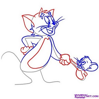
The artist use gray lines heavily to construct the basic body shapes of each individual characters. The gray lines are used to make body shape enclosures while position them correctly into their proper locations. The blue, red line is the iterative process, giving more detail to the exist body shapes of each individual characters. They also represents light directions, which helps the artist to place shadows and colors more correctly. The important part of design and sketch process is to position each element correctly, such as characters, backgrounds, lightings, and actions. These design successfully accomplish these important goals, which helps the artist to have strong foundation for a successful work. 

good and bad design -week 6


This poster demonstrate a design that successfully present its goal to its target audiences. Print advertisement designer focuses on present an idea to audiences with symbols that empower original ideas into powerful statement. The artist of this picture presents a balanced but sharpen structure through contrast. Even though that most of poster presents negative area, such as the blue background, but the color of the positive symbol, the white pigeon, successfully sharpen the ideas of this poster. The white pigeon that flies upward and the enlarged word “Peace” balances the poster and makes it to have a sense of level. It uses other color such as green in symbol, the green leaf, with the word to tight the balance. Three colors that are chose for these image also presents similar idea, the peace and softness. These techniques build an idea of Peace into a powerful and sharp idea that have great impacts on its listeners.


This poster presents an unsuccessful attempts to present the point to its audience. Major design mistakes that print advertisement designers make is fail to help audiences to understand and accept the point. One of mistakes that this image presents is fail to sharp out the main idea. There are too many overlapping areas that make the main idea, which is the football player, difficult to see.  It is a stress on the middle of this poster.  It looks so busy and too much detail on it. The contrast of colors between the negative background, which is the mixture of gray, violet and orange, and the positive symbol, which is the white football player, is difficult to distinguish. The orange color of the negative background is sharpen than the white color of the positive symbol. The first moment that audiences view this poster, the orange background will be the first sight instead of the football player. These techniques fail to attract audiences to understand and accept the target point of this poster, since ideas are neither clear nor strong enough to be understand and accepted.