
This artwork represents a successfully poster that persuade its viewers. The majority parts of this image are constructed by the tone element. The gray tones that are presented throughout the entire poster to emphasis the feeling of sadness and helpless in the life of this child. The feeling of sadness are enforced through the contrasting of firearm and the seriousness of the child and his age. The artist presents the seriousness through applying heavier dark tones on the face to represent the heaviness hardship that this child encounters. This poster emphasized the hardship using gray tone as negative background while using light dark red on the positive to empowers the concept of infant sadness. The artist uses different colors to separate the word, infantry, to reveal the sadness behind the child infantry. The white color tone is used to separate the word, infant, from the rest of the word to represent that infant are born to be innocent. The black color tone is used to separate the word, ry, from the rest of the word to represent that darkness within human races force these innocent infants to become dangerous infantries. The red background represents blood that spread while these child soldiers eliminate life of others. These techniques successfully construct an overall sadness while powerful concept to viewers of infants who are used as weapons to eliminate others. The most important for designing a poster is to make the viewers understand the concept of it through the first glance.

There are enormous color elements usages within this image. The artist uses fresh and bright color to contrast with each other, which enforces each shapes to stand out from each other. These techniques enable the image to pop out from the poster. However, the author also uses contrast color to emphasis the shape of the main character in this image. Blue and yellow are contrasting color so people would focus on the Snow White more than other seven dwarfs due to the hight contrast between these two colors. The saturation of the positive characters is stronger than negative background so viewer would focus on the positive characters. Colorful images present an feeling of warmness and happiness, which will attract many viewers such as child. Most of colors on the children’s book are fresh and light to emphasis the feeling of happiness and warmness to comfort and care to their readers, especially child.
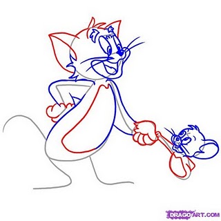
The artist use gray lines heavily to construct the basic body shapes of each individual characters. The gray lines are used to make body shape enclosures while position them correctly into their proper locations. The blue, red line is the iterative process, giving more detail to the exist body shapes of each individual characters. They also represents light directions, which helps the artist to place shadows and colors more correctly. The important part of design and sketch process is to position each element correctly, such as characters, backgrounds, lightings, and actions. These design successfully accomplish these important goals, which helps the artist to have strong foundation for a successful work.
No comments:
Post a Comment